Marketing codes: how brands hide messages
Disclaimer: The editorial team of The Global Technology reminds you that smoking is harmful to your health.
“Even God needs bells.”
A slogan by French advertisers
What could possibly connect such different things as tobacco, psychoanalysis, geometric figures, and marketing? Mathematics, country of origin, year of discovery, subjective factors, mistakes, or perhaps a specific person who loved them all? No, the connection runs much deeper and is far more intriguing. All of these concepts are closely tied to encryption.
As the great Wikipedia states (let’s turn to it as the most accessible source):
Encryption is a reversible transformation of information aimed at concealing it from unauthorized individuals while at the same time granting access to authorized users. Primarily, encryption serves to ensure the confidentiality of transmitted information.
Not the most detailed explanation. After all, beyond its primary functions, encryption helps convey important information from the source to the recipient. It makes this information clear, accessible, and easily understandable for a specific audience.
Encryption is embedded in every message we receive from the outside world. It surrounds us everywhere: the cryptic language of Zoomers, emojis in Telegram, inside jokes that only two people in a group understand, social media posts, and advertisements from famous brands—all of these, without a doubt, can be considered a form of encryption.
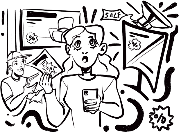
We didn’t mention advertising and marketing by chance—they are filled with codes. Every day, whether you come across a bold and creative ad online or take a flyer from a shopping mall promoter, you are interacting with messages crafted by marketers and businesses. When you make a purchase, often without even realizing it, you’ve deciphered a code—you’ve read something that was meant specifically for you.
Inside every major corporation, entire empires operate, where skilled marketing “cryptographers” work tirelessly to convey the essence of their message through tiny, carefully crafted signals. And here’s the fascinating part: these codes function purely on the level of metaphor and belief. Yet, every single day, we unconsciously decode the encrypted messages that thoughtful marketers have left for us—hidden in car logos, catchy slogans, and even flyers that accidentally catch our eye.
Encryption and Marketing: What’s the Connection?
There was a time when advertising worked with a direct approach—no encrypted messages were needed.
Imagine this: if there are only two fruit stalls in the market, you will likely choose the one with slightly lower prices and sweeter fruits. Now, let’s say you personally know the owner of one of them, and they offer you a discount—your choice is obvious.
But what if there are four fruit stalls, all with nearly identical prices and quality, and you don’t know any of the sellers? What if there are a hundred stalls?
As product variety grew, market economies expanded, and information flow increased, selling became more and more difficult. Price and quality were no longer the only decisive factors, and products began to get lost among competitors.
That’s when marketers started inventing all sorts of techniques to ensure that any given product could stand out in a crowded marketplace.
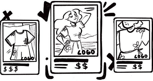
Today, branding helps businesses solve this challenge—it’s the process of shaping a company’s positioning and recognition. A strong brand with clear and powerful messaging will never get lost among competitors. Simply put, branding is the set of thoughts and strong associations that an audience has about a company.
Every interaction with a seller—or more accurately, with a brand—begins with a glance. From the very first encounter, a company conveys its messages to consumers using specific visual symbols: logos, signature colors, and fonts. And the fascinating part? The average person doesn’t need to consciously understand these symbols to interpret the message correctly.
And this brings us to codes and encryption.
The shapes and symbols used in logos make them visually attractive while also transmitting crucial messages about the brand. Every symbol, every little dot, carries with it a specific idea.
Circles and ovals, for example, are associated with harmony and cyclicity. They represent something whole and safe. Through these elements, a brand can emphasize its reliability and stability. At the same time, the circle is a space that constantly expands, grows, and transforms. Think of the logos for Pepsi and Toyota, where circles and ovals are used as key elements.
The triangle, on the other hand, symbolizes strength, dynamism, and movement. It seems to urge action and push forward. The Adidas logo serves as a confirmation of this.
Squares and rectangles are symbols of reliability. Brands that incorporate these shapes into their logos are saying, “We are grounded and dependable.” Additionally, the square evokes a sense of clear structure and professionalism. A great example is the Microsoft logo, which uses square forms to communicate ideas of stability and reliability.
Of course, it’s not that simple. Each company imprints in these symbols not just general meanings, but also its own unique messages.
The Givenchy logo consists of the letter “G” repeated four times. The result is quite an interesting figure: on one side, it’s a solid, reliable square, and on the other side, it resembles a clover, which brings good luck.
As for the Versace logo, it contains a mythological message. It features Medusa, symbolizing the fatal allure of women.

We can’t pass by the logo of the world’s largest digital international art space, The Wall Global. The logo features a hand—a symbol of openness, friendliness, and readiness for communication and collaboration. The hand unites people from different countries and continents, and it also represents the mark that anyone can leave in the digital world forever.
In addition to geometric shapes, logos often incorporate symbolism: images of animals, plants, and anything else that might come to a marketer’s mind. The goal is to evoke the right associations and not harm the brand’s identity.
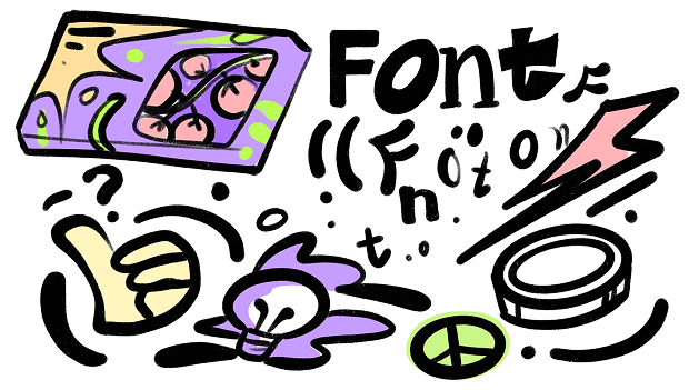
But the symbolism of the logo isn’t the only carrier of information. Alongside it, two other crucial brand elements—color and fonts—come into play.
In marketing, there is a concept called “color psychology.” Experts who study brain reflexes explain that the human subconscious contains stable associations that give meaning to various colors. In branding, this becomes a strategic tool that influences people’s emotions.
You’re probably not eager to buy fruits and vegetables packaged in toxic, unnatural colors—such hues immediately bring thoughts of chemicals and pesticides. A dark purple sign for a massage salon would make you question its focus (if you catch my drift). Similarly, imagine a BMW showroom painted in all the colors of the rainbow—style and status would instantly disappear, right?
Red contains a call to action, passion, and a burst of energy. Blue, on the other hand, doesn’t encourage action. It’s associated with reliability, responsibility, and safety. It evokes something global, boundless, and grand. Shades of blue are most often chosen by brands whose products or services need to inspire customer trust, calm, and stability. Yellow, with its bright, joyful, and stimulating energy, is associated with intelligence and expressiveness. It enhances concentration, helps organize, improves memory, and promotes fair and quick decision-making.
The logo of our magazine is also painted in gold for a reason. We wanted to convey the message that knowledge is a treasure that is priceless.
While the choice of brand colors is relatively straightforward, selecting a font often takes quite a bit more time. Many companies use existing fonts, but some go the extra mile to highlight their uniqueness by creating custom ones.
Fonts constantly communicate something to us. They alter the tone of sentences, set the mood, and create the atmosphere. Their geometry and design can reveal a lot about the brand using them. Decorative fonts make a brand unique, angular ones convey openness to consumers, handwritten styles emphasize friendliness and openness, and strict classic fonts communicate reliability and stability.
The most popular font in the world is Helvetica. And in fact, many brands use it. What makes it so special?
It is considered perfect in its simplicity. It doesn’t draw attention to itself but instead supports the brand’s message. Strict, restrained, and readable, the font is favored by brands such as Behance, BMW, Energizer, Intel, Jeep, Knoll, Lufthansa, Nestlé, Olympus, Panasonic, Parmalat, Scotch, Target, Tupperware, and many more.
In their work, marketers don’t always rely on visible symbols and messages. There’s also something you can’t touch or see, but can only feel.
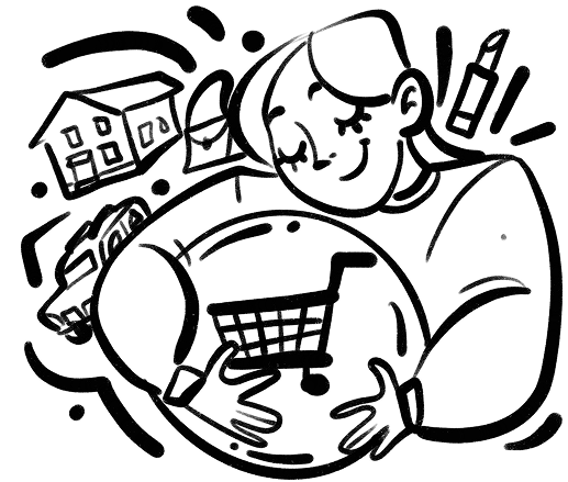
According to marketers, based on numerous studies, when people make a purchase—whether consciously or unconsciously—they are fulfilling a need, a pain, or an emptiness inside. Or they are solving a problem. Then the item stops being ordinary; it acquires a deeper meaning, one that only the buyer understands. When purchasing an SUV, a person is seeking safety, and when buying a big, sun-filled house, they are fulfilling the dream of having a large, loving family.
A need can be both obvious and hidden, tucked away from the eyes of others. Sometimes, without even realizing it, we read certain signs and buy something not because we practically need it, but because it brings us the desired feelings and emotions. These kinds of purchases make the “life of our dreams” more accessible, bringing it closer and complementing our reality.
A bag from a renowned fashion house makes a woman feel part of an elite, exclusive society, giving her a sense of a different quality of life and a new perception. Her surroundings remain the same, but her inner world changes. She is no longer Eva, rushing to work at 8 a.m., stumbling and fixing her messy hair. Instead, she is Eva, confidently walking with the proud stride of a businesswoman, carrying an expensive handbag. Can you feel the difference?
Once specialists realized this, advertising messages stopped being flat and faceless. They became purposeful and targeted. They were meant for specific people who would definitely “read” the message and respond to it.
But marketers went even further!
Sometimes, they encode their messages in such a way that you, unknowingly, become a consumer and part of their target audience.
How One Man Made the Entirety of America Smoke
Let’s rewind to the early 20th century. In the Puritan country of America, which had strong religious traditions and strict moral principles at the time, women were significantly oppressed. Although they had more rights compared to the 19th century, they were still limited in many ways.
For example, women were prohibited from smoking, especially in public places. “Well, that’s a good thing,” you might say. From a health perspective, undoubtedly! But any form of oppression breeds a sense of limitation, injustice, and a desire to break the rules. When such desires exist in people’s minds, all you need is to exploit them in the right way.
This is exactly what Edward Bernays, the brilliant PR specialist and event marketer, realized when he was approached by the president of the American Tobacco Company. Tobacco manufacturers saw women as potential customers, but due to restrictions and taboos, they couldn’t increase cigarette sales among them. In this context, the tobacco company “Lucky Strike” reached out to Bernays to help them increase sales.
“As always, it’s not things that are being advertised, but simple human happiness. You see the same happy people in different scenarios, but the happiness is caused by different acquisitions. That’s why people go to the store not for things, but for this happiness, even though that isn’t what’s actually being sold.”
Viktor Pelevin, Generation P
By the way, we forgot to mention the famous uncle Bernays – Sigmund Freud. Speaking of Bernays, we can’t forget his famous “uncle” – Sigmund Freud. The well-known psychoanalyst and father of psychoanalysis, without even knowing it, played a part in this story. His teachings formed the foundation of the encoded messages in this PR campaign.
Bernays sought to understand what cigarettes meant for women, what significance they held. The answer came from one of Freud’s students, psychoanalyst Brill:
“Today, women’s emancipation has suppressed many of their feminine desires. Many women now do the same work as men. Many women don’t have children. Women are becoming more like men. Cigarettes, which are associated with the male circle, for women become torches of freedom.”
A cigarette (or, as Freud would call it, a “phallic object”) in a woman’s hand was positioned as a symbol of strength, independence, and freedom. The woman was now on equal footing with men—not with one foot, but with both.
But how to convey this message to the masses? The decision was made to use the usual advertising and PR tools and add event marketing to the mix.
The advertising campaign started with a warm-up. It was crucial to convince the public that smoking wasn’t harmful. The attack came from two sides. On one side, Lucky Strike ads promoted the benefits of smoking, emphasizing its calming effects. Headlines and posters claimed that smoking helped effortlessly shed excess weight and protected against obesity. On the other side, ads highlighted the beauty and elitism of this habit, drawing on images of sophisticated European women from high society, where female smoking was practically uncriticized.
Famous women were recruited for the campaign. For instance, Marlene Dietrich (1901-1992), the German actress and singer who later became an American citizen, was featured in one of the posters with the words: “I smoke Lucky Strike!”
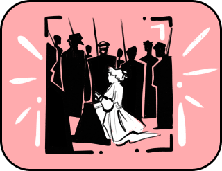
The apex of this massive advertising campaign was the “Torches of Freedom” parade. Bernays enlisted the feminist movement.
On April 1, 1929, a woman named Bertha Hunt, marching along New York’s 5th Avenue in the crowd of the annual Easter Parade, unexpectedly pulled out cigarettes hidden in her stockings and lit one. Following her, more and more women in the parade lit cigarettes, and the press, who were already aware of the event, closely watched what was happening.
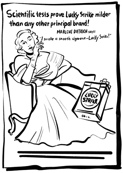
After the event, its participants—among whom were several actresses invited specifically for the occasion—expressed to the press their hope that “these torches of freedom would destroy all the existing discriminatory smoking bans for women.”
This entire advertising campaign sent an important message to women that resonated in their minds: when a cigarette is in your hand, you are free, you are strong, you are independent! And women decoded this message: some understood it immediately, others took some time, and some just followed the trend. But that no longer mattered, because the message worked! The campaign successfully achieved certain commercial results and triggered significant social changes.
By cleverly encoding its messages in advertisements, Bernays transformed cigarettes into a mandatory accessory for independent feminists, and later for confident, strong women. This is a prime example of how marketing and advertising tap into deeply buried needs and pains, investigate them, and offer solutions to these problems in encrypted advertising messages.
We believe that after reading this article, you’ll look at the advertising messages that resonate with you in a whole new light, and understand what hidden message they are trying to convey. After all, any encrypted message loses its power as soon as it becomes obvious.
Scientists have decoded the human genome. We’ve decoded the genome of interest. Only pure science and facts.
Thank you!